
#1: exploring colour and looseness
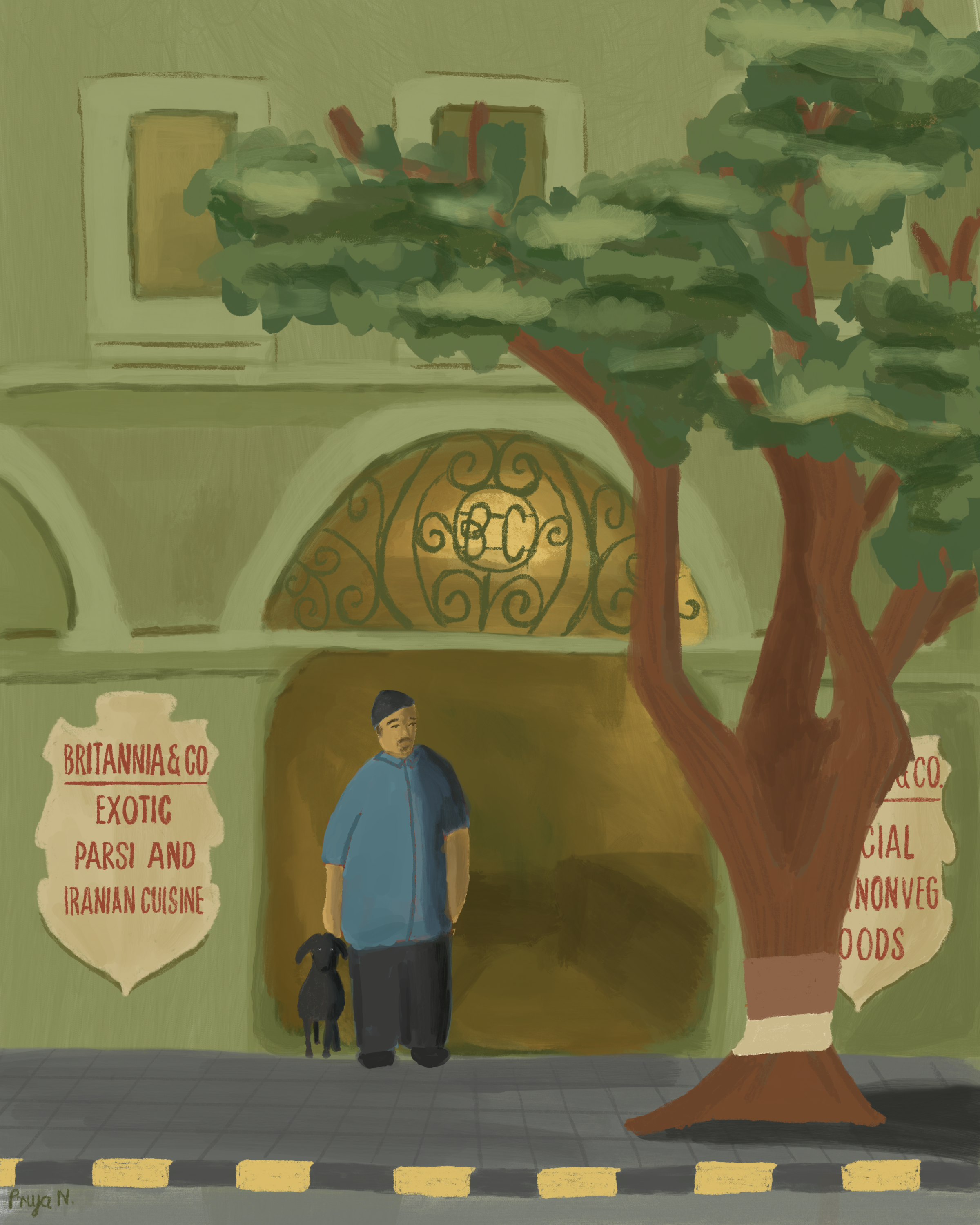
This illustration of Britannia & Co, an Iranian cafe in Bombay, became an exploration in colour and looseness. It was pastel when I started as I usually would shy away from darker colours in worry of the artwork looking 'dull'. I’m consuming a lot of content, videos, artwork to learn more and be able to voice what is in my head through art. Previously, I would focus on small areas of the piece and lose track of the bigger picture. This resulted in some features looking more realistic than others, some areas looking flat etc.
I’m training myself to constantly take a step back, think about colour, mood and cohesion. My inspiration is always people in moments of calm. Recently I’ve been referencing my personal life and drawing more from photos I’ve took such as the two below of my partner. The left is from our favourite wine bar in east London, WeinoBIB and the right is our holiday in Lake Como.


I also love watching videos by Sandi Hester to learn more about staying loose. I am always so inspired by Richa Kashelkar and Rimdraw and in awe of their style.
I’m still not fully satisfied by my style but it's a process! I feel a lot of potential and excitement for what could come of this.